Tuesday, May 31, 2011

Rationale

In this assignment I have looked at celebrity culture and the insane fascination we have with celebrities; always wanting to know their every move no matter how ordinary it is. Reading about them in magazines and following them on social networking sites like twitter just to hear they had a coffee from Starbucks that morning.
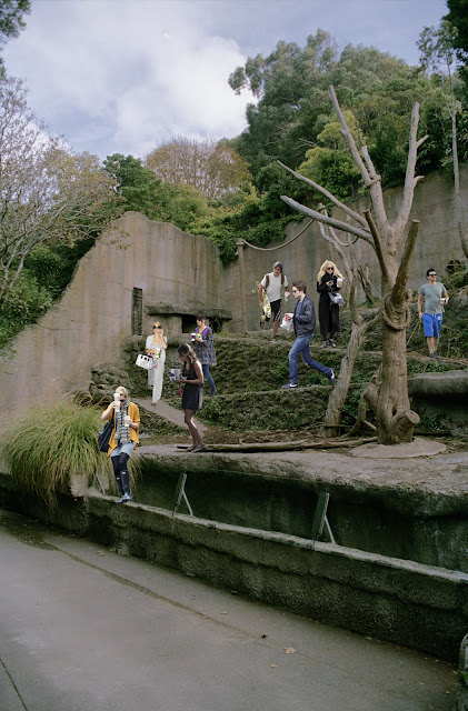
By using photomontage I was able to create an image that puts emphasis on this idea. Using paparazzi photo's from magazines and online gossip sites that reflect and portray this idea of constantly being watched. I chose to contrast this with animal enclosures, playing on the similarities between the way we watch animals at the Zoo and way we watch Celebrities.
The four photograph's in the series each display different mundane activities we commonly see Celebrities doing, whether it be drinking coffee, out with their children. exercising or relaxing at the beach. I have carefully chosen the background enclosures enhance each these activities and also replicate the animals who originally occupied the space, such as the Bears wandering around exploring new things, the Baboons sitting in separate little groups, the Meerkats scattered around each doing their own thing, and the giraffe's constantly walking back and forth along the path in a circuit.
I arranged the final series so the background enclosures in each photo link together unifying the images creating visual flow across the series.


Sunday, May 29, 2011

How to present?

How to present? Looking at the different layouts I can have my series - What works best?


 I quite like having the series in a grid as the first and last photo's are walking/running towards the other two photo's - making eye flow through series?


Linking the heights on the enclosure walls between photo's. Again I quite like how the series starts and finishes with the celebrities running into the other photo's. Also breaks up the green grass enclosures nicely. 


I like how the tree's line up the the first two images and the wall lines up in the last two. Although the first two images have a lower skyline than the last two.. could be a bit weird.


I like how the last two photo's create a diamond shape with the wall and the log, but i don't think the series flows so well in this order as it does in some of the others. 


Being portrait I quite like having the images in a line, I think when the photo's are printed 14 x 9 they might look a bit weird in a grid and be a bit harder to see and wont be at the viewers eye line.. 


Refinements

Refining my final images for the series.


I think changing Lindsay Lohan who was running away from the camera for Reese Witherspoon works better as Lindsay was the odd one out, and also adding Jessica Simpson which I find balances out the space created by the smaller Reese Witherspoon.


After adding Amanda Bynes like suggested in class I find photo feels more complete. 


Looking at these two images.. Although I want the enclosure to look crowded, need to work out how much is too much, and have a certain amount of composition to the image and placement of the people - scale of people needs to also be reasonably consistent with perspective of image. (Arnold Schwarzenegger is too orange!) The second photo seems more resolved.

Contact 2

Tuesday, May 24, 2011

Feedback

Class feedback from final presentation before hand-in:
 
Backgrounds seem a bit dull
Full Meerkat enclosure will celebrities at the beach.. replicate packed beaches at popular holiday destinations.
Include celebrities with their children
Look at having people on the footpath of celebrities with coffee
Crop photo's to the same shape/ crop out giraffe 
Print Big!


Sunday, May 22, 2011

Celebrity Zoo


What I have so far...
Celebrities grouped by what they are doing: exercising, eating/drinking coffee, and at the beach.
Things I need to consider:
- colour of each person (so they fit with the background/get the colour/brightness of the skin tones consistent)
- decide if I want them bigger in relation to the background (down size the background image?),
at the moment I haven't changed the size of any of the celebrities, they are at the size of the original sourced image.
- get an idea on how big I want to print the final images.
- how many people should be in each image? How many is too much?
- composition of each image... what are the people doing in relation to each other


Also looking at other scenes for the series - Celebrities with their families/children (images happen to be bigger in this photo.. do I like this? does it need more people/better composition - feels unfinished) and other possible backgrounds. Don't know if I should use the image on the right as although it has good equipment/objects in the enclosure it also has the city/suburbia in the background so doesn't quite fit with the other photographs.


Below are all the images I have sourced and played around with while deciding who to use and what they should be doing.


Celebrities

Little People

Here is a blog I found which has these cool installations that play with juxtaposition and scale. I like how they show both a close image of what's happening and then one which gives us an idea of the scale of the scene. It reminds me of what i'm doing as he is putting people in a space creating a scene that wouldn't normally happen.

"My 'Little People Project' started in 2006. It involves the remodelling and painting of miniature model train set characters, which I then place and leave on the street. It is both a street art installation project and a photography project. The street-based side of my work plays with the notion of surprise and I aim to encourage city-dwellers to be more aware of their surroundings. The scenes I set up, more evident through the photography, and the titles I give these scenes aim to reflect the loneliness and melancholy of living in a big city, almost being lost and overwhelmed. But underneath this, there is always some humour. I want people to be able to empathise with the tiny people in my works." - Slinkachu


 http://little-people.blogspot.com/


Monday, May 16, 2011

Celebrity Culture

I've decided to portray celebrity culture looking at the insane fascination we have with these people for my photographic issue for this assignment.
I think it's interesting how we are constantly wanting to know what they are doing, we can never get enough of them even if what they are doing isn't very interesting or glamorous.


What I need to improve from my concepts:
- get the colour the same between images (are the whites and blacks the same?) 
- good quality/ high resolution images of celebrities; source magazines, high resolution images of the web?
- what do I want the people in the images to be doing?
- do I need more pictures from the zoo?

The different cages/areas in a Zoo separate different species: Lion, Giraffe, Chimpanzee.... How can I replicate that in my photography?

- Divide them by era - 60's, 70's.. to present 
  (might not be as strong a comment as media has changed so much in this short time) 

- What they do/ their career: actor, singer, socialite, model

- What they are doing in the picture: working out, at the beach, shopping, at a premiere? 
  (might not fit with the others/ or could be a nice break.. puts them in a kind of context?)